

Homepage Sections Every Business Website Needs
Short answer: a business homepage needs 7 sections in this order: a first screen that says what you do, for whom, with one action; proof; services; how it works; a starting price; a short about; and a contact block that works on a phone. Under 600 words in total. The first two screens carry the decision, because that is where most viewing time goes.
Research figures below are from Nielsen Norman Group's published eyetracking and reading studies, checked 18 October 2026.
What goes on the first screen?
The first screen is the only part of the homepage most visitors read in full. Nielsen Norman Group's 2018 scrolling study found users spend 57% of page-viewing time above the fold and 74% in the first two screenfuls. Its 2008 reading study estimated that on an average visit users read about 20% of the words on a page.
So the first screen has three jobs and nothing else:
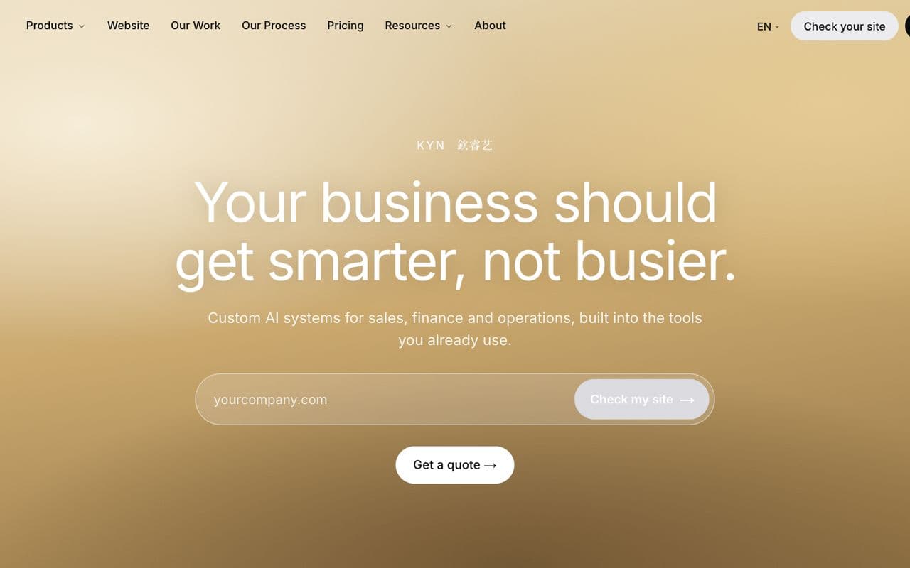
- What you do. A headline of 6 to 12 words naming the service in the customer's words. "Dental clinic in Tampines" beats "Your smile, our passion".
- For whom. One sentence naming the customer and the result: "For families and working adults, same-week appointments."
- One action. One button, the action you most want: WhatsApp, book, call or get a quote. A second, lighter link is acceptable; a third is a menu.
What the first screen does not need: a carousel, a video that autoplays, a welcome message, a tagline that could belong to any company, or two buttons of equal weight.
On a phone, check that headline, sentence and button all fit in the first view at 390 pixels wide. If a background image pushes the button below the fold, the image is the problem.
What counts as proof?
The second screen answers the question the first screen raised: why this business. Proof is specific and checkable.
- Numbers. Years in business, customers served, jobs completed, locations, staff. Only the ones you can defend.
- Reviews. 2 or 3 Google reviews quoted in full with the first name and the date, and a link to the profile with the count and the average.
- Logos. Client, certification or association logos, with consent. 4 to 8, not 20.
- Credentials. The licence number, the accreditation, the registration, each linked to the register that confirms it.
- One result. A before-and-after, a case figure or a photo of finished work, where the rules of your sector allow it.
Reviews pasted from memory, stock photos of staff and star ratings without a link are not proof. Visitors recognise them, and the 2026 CCS action on fake reviews shows regulators read them too. See Google reviews rules in Singapore for what is allowed.
How should services be listed?
The services section is a directory, not a description. Its job is to get the visitor to the right page.
- One card per service, 3 to 8 cards. A business with 20 services groups them into 4 to 6 categories here and lists the rest on the service pages.
- Each card: the service name, one sentence of who it is for or what it includes, and a starting price where you have one.
- Each card links to its own page. A homepage that describes every service in full has no reason for service pages to exist, and search engines rank the specific page, not the homepage, for the specific search.
- Order by what customers buy most, not by what you want to sell most.
Product businesses follow the same pattern with categories in place of services.
Why include how it works?
Three or four numbered steps from enquiry to delivery remove the uncertainty that stops a first contact. "Message us on WhatsApp, get a quote within 1 working day, confirm, we deliver in 14 days" tells the visitor what happens after the button. Keep each step to one line. Put a timeframe on each step if you can keep to it.
This section is also where AI answer engines find the facts they quote: timeline, process and what the customer has to provide.
Should the homepage show pricing?
A starting price or a range, yes. The full price list lives on the pricing page.
- A starting price filters visitors who were never going to buy, so the enquiries that arrive are closer to a sale.
- A number is what search results and AI answers quote. "From S$2,000" appears in an answer; "competitive pricing" does not.
- If prices vary too much for one figure, give the range and the three factors that move it.
- If your sector restricts price advertising, state the consultation fee or the fact that quotes are free.
The objection is that competitors will see it. They already know. The customer is the one who does not.
What does the about section need?
Two to four sentences: who runs the business, since when, where, and what you specialise in. A photo of the real people. A link to the full about page for the rest. The homepage about section is a trust check, not a history.
How should the contact section work on a phone?
The contact section is last on the page and repeated as a fixed button on phones. Every element must work with a thumb:
- WhatsApp link with a pre-filled message, so the first line of the chat says which page it came from.
- Phone number marked up so it dials on tap.
- Address linked to the map listing, with the nearest MRT or carpark.
- Hours, matching the Business Profile exactly.
- A short form of 3 to 5 fields, writing to your own database, with the consent line beside the button.
- Response time stated as a fact: "Replies within 1 working day."
Which channel to lead with is covered in WhatsApp vs contact form. What matters on the homepage is that one of them is reachable from every screen.
Section order and word counts
| Order | Section | Job | Words | Phone check |
|---|---|---|---|---|
| 1 | First screen | What, for whom, one action | 20 to 40 | Headline, sentence and button visible without scrolling |
| 2 | Proof | Why this business | 40 to 80 | Reviews readable; logos in two rows at most |
| 3 | Services | Send the visitor to the right page | 60 to 120 | Cards stack one per row; each tappable |
| 4 | How it works | What happens after the button | 40 to 80 | Steps numbered, one line each |
| 5 | Pricing | A figure to decide on | 30 to 60 | Price visible without opening anything |
| 6 | About | Trust check | 40 to 80 | Real photo, not cropped off |
| 7 | Contact | Make the enquiry | 40 to 80 | WhatsApp, call and map each one tap |
| Total | 270 to 540 | Fixed contact button on every screen |
A homepage inside these counts loads fast, reads on a phone and leaves the detail to the pages that rank for it. The wider rules on type, colour and layout are in web design best practices.
Checklist
- Headline names the service and the customer; no tagline.
- One primary button in the first screen; it opens WhatsApp, a booking or a form.
- Proof section with linked reviews, defensible numbers and real photos.
- 3 to 8 service cards, each linking to its own page.
- 3 or 4 numbered steps with timeframes.
- A starting price or range.
- About in 4 sentences with a real photo.
- Contact with WhatsApp, tap-to-call, map link, hours and a short form.
- Fixed contact button on phones.
- Total under 600 words; first two screens hold the decision.
- Hours, address and phone identical to the Business Profile.
What cense does
cense builds business websites from S$2,000 with the first draft 14 days after one call and up to 20 rounds of edits, and builds the enquiry form in-house so every lead lands in the client's own database. See web design Singapore.
What should the first screen of a homepage say?+
What you do, for whom, and one action. A headline of 6 to 12 words, one sentence under it, and one button. On a phone, the headline, the sentence and the button must all fit without scrolling.
How many sections does a business homepage need?+
Seven: first screen, proof, services, how it works, pricing or a starting price, about, and contact. Each section has one job and one heading. Most business homepages need under 600 words in total.
Should prices be on the homepage?+
A starting price or a range, yes. It filters enquiries that were never going to buy and gives the page the figure that search engines and AI answers quote. Full price lists belong on the pricing page.
Where does the contact section go?+
Last on the page, and repeated as a fixed button on phones. It needs a WhatsApp link, a phone number that dials, an address that opens a map, and hours.
How long should a homepage be?+
Short. Research by Nielsen Norman Group found users read about 20% of the words on an average page and spend 57% of viewing time above the fold. Put the decision-making facts in the first two screens.